


Kizen had a top-selling meat thermometer on Amazon and a product line that competed with itself. We worked to re-business Kizen into a future-ready food prep brand with emotional depth, cultural precision, strategic clarity, and a visual system built to grow.
Our process
The MIDS Method
Kizen is a prime example of how the MIDS Method turns potential into clarity, design, and meaningful business impact.
The problem: clutter, confusion, and product cannibalization
Kizen had a best-selling product on Amazon—a digital meat thermometer—but no cohesive brand to support it. Strong sales masked a lack of cohesion. The rest of the product line created internal competition, consumer confusion, and no clear reason for loyalty. Without a story or system, the brand couldn’t scale or differentiate.

Making it make sense
Re-businessing is more than a rebrand. It's more holistic. It's taking whats really working in the business and building outward from there. Re-businessing is applying design research insights across every part of the business. These insights informed everything from product line logic and industrial design to brand execution and launch strategies.
How do we craft accurate insights? Human-centered design research. We gathered data from Amazon, analyzed market trends, sales and search volumes, customer acquisition and manufacturing costs, and surveyed 2,000 people to understand people’s real habits, hopes, and fears around cooking.
Three key insights

Physical: Precision builds confidence
The right tools instill chefs (both professional and home chefs) with confidence, so we designed simple tools for every stage of food prep that people would be proud to use.

Cultural: Post-COVID, hosting returned—but anxieties remained
Home cooking was back, but consumers had heightened sensitivities to cleanliness, safety, and precision in the kitchen.

Business: A platform unlock changed the game
A newly added “New Version” widget on Amazon product pages offered essentially free advertising, allowing us to parlay the success of the existing product into the new line.
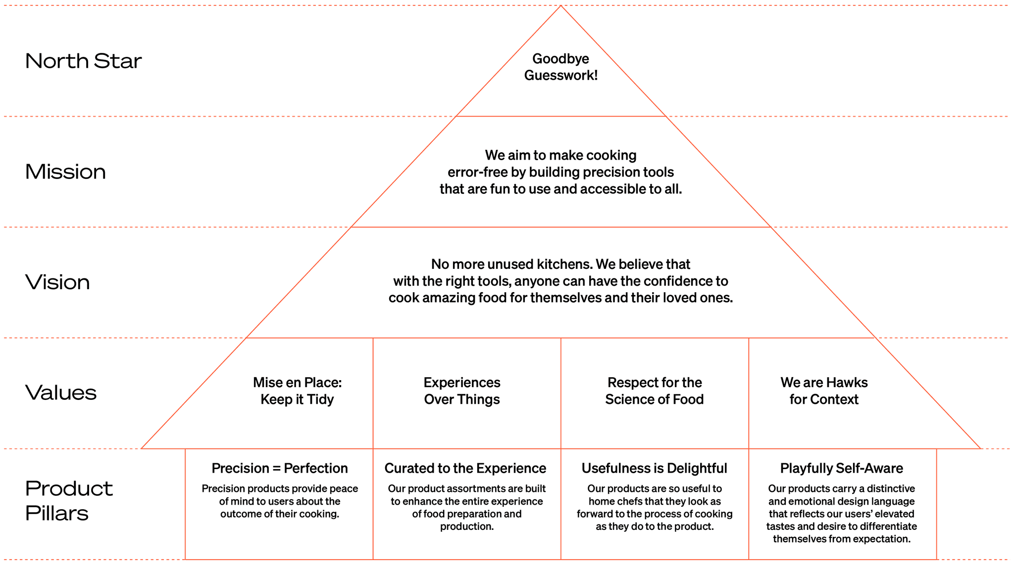
The brand house
The brand house defines the emotional and functional promise of the brand. This is our unifying design rubric—a system of values, tone, and priorities that helps us evaluate every decision. Its our objective compass: if a product or message doesn’t align with the brand house, it doesn’t ship.
The weight of a good brand
With the Re-Business Plan as our north star, we brought strategy to life through intentional, insight-driven design. Every artifact—whether digital, physical, or visual—served a clear purpose. Nothing was decorative. Form followed function. Style served strategy. This is how design becomes direction.
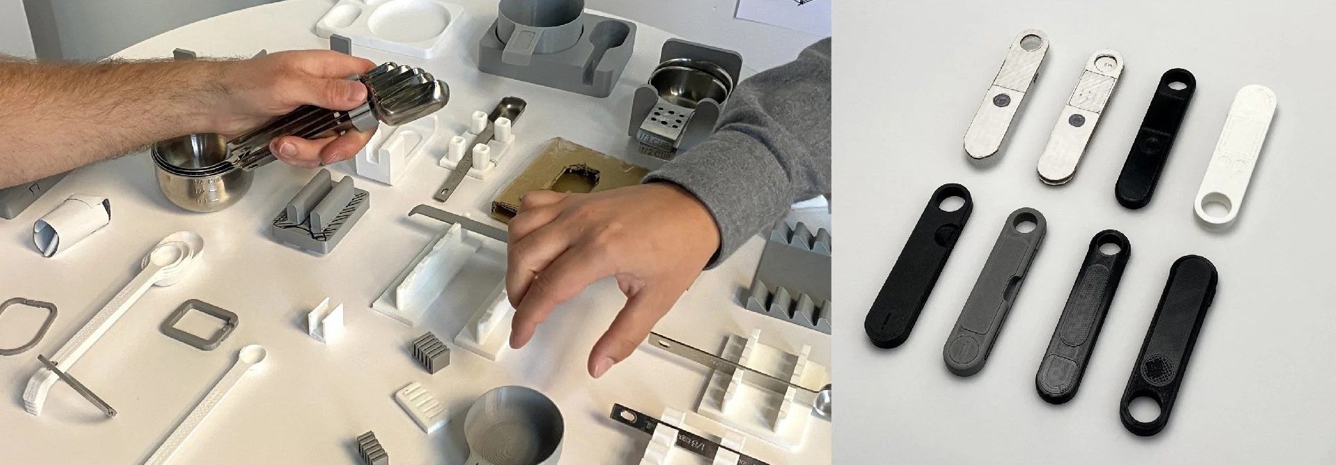
Product Design
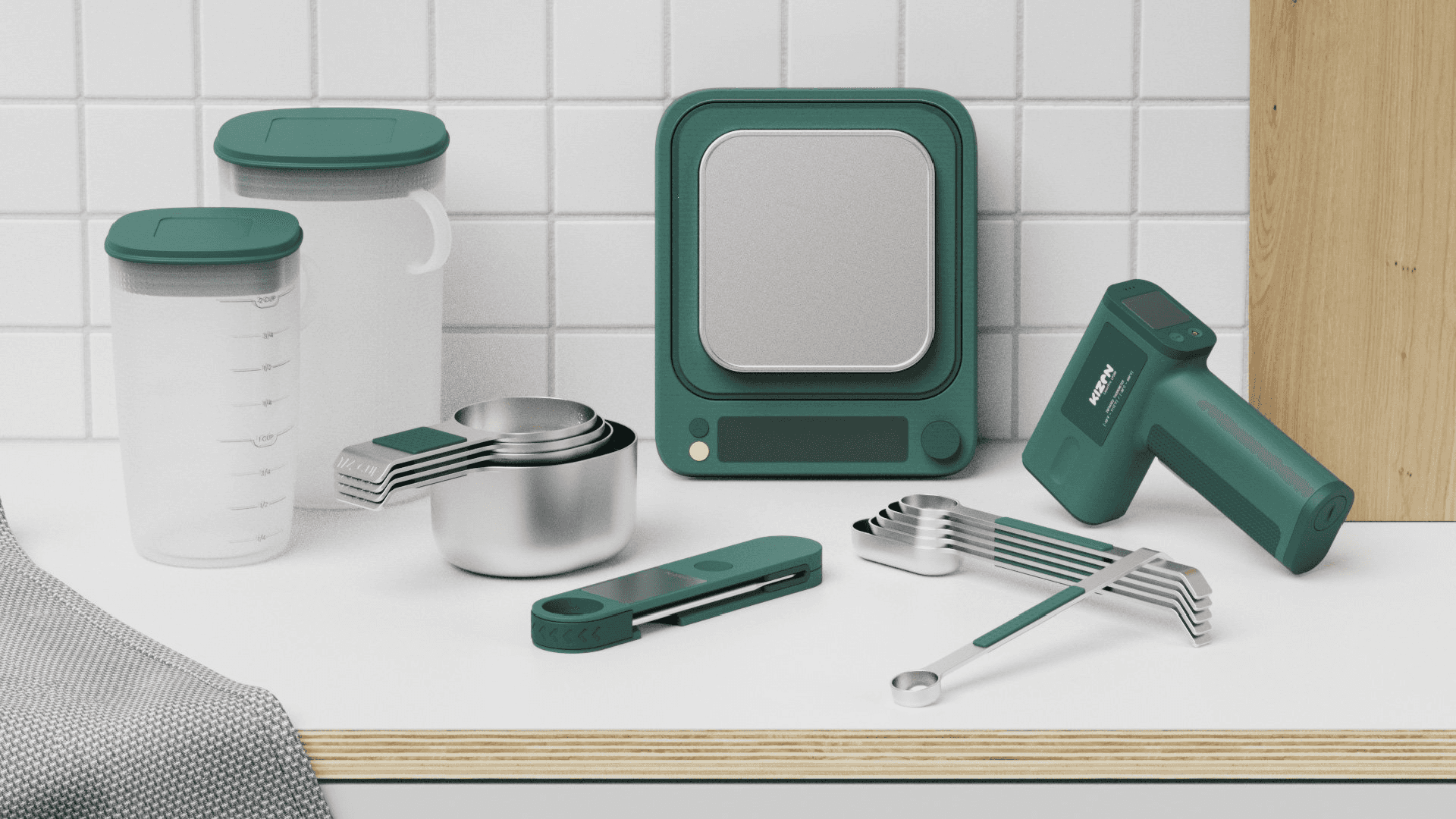
We reimagined Kizen’s hero thermometer and surrounding product ecosystem with clarity and usability in mind.
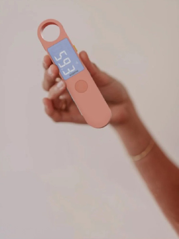
UI and industrial design updates emphasized legibility, comfort, and precision
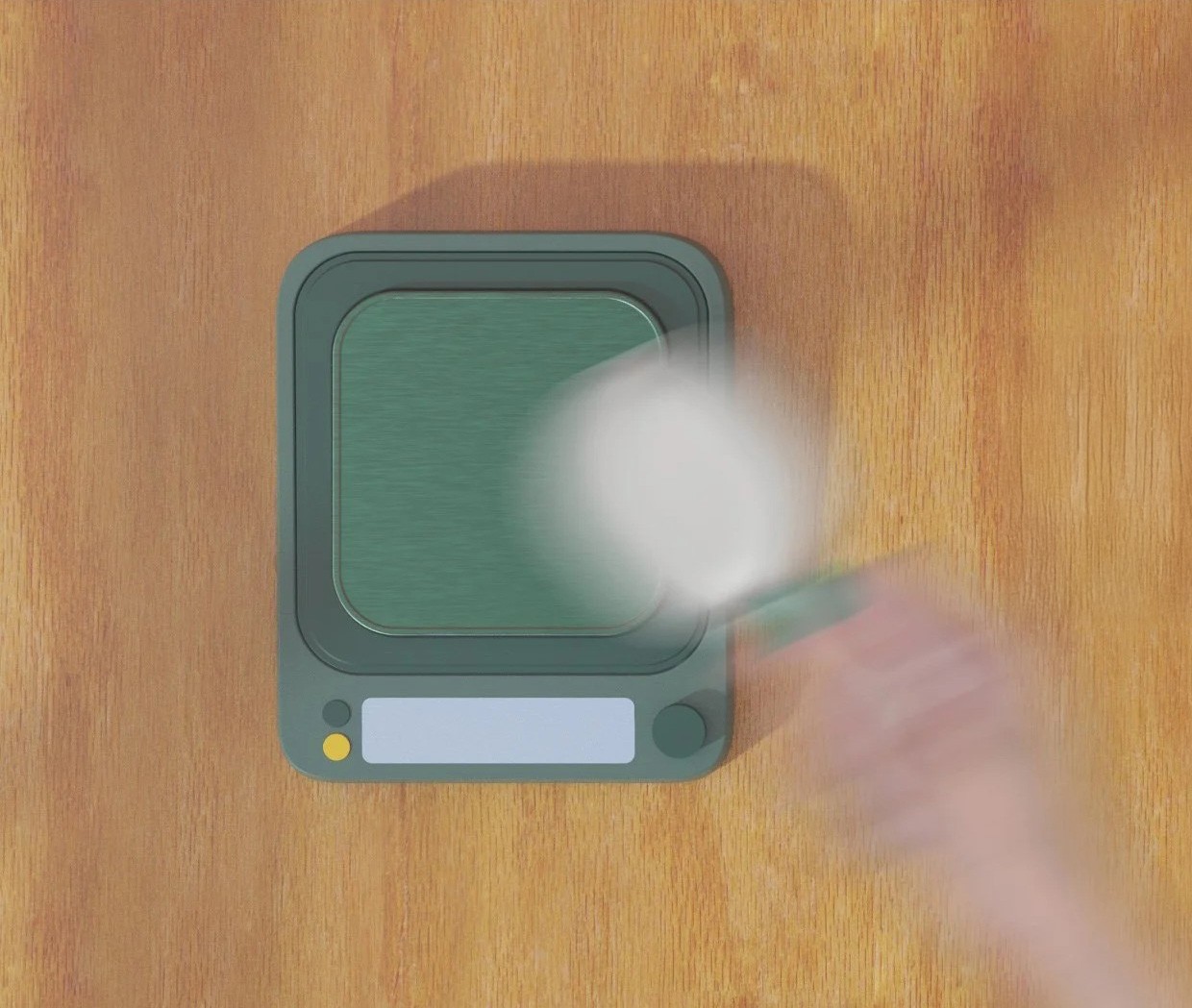
Form, materials, and silhouette reinforced countertop presence and brand continuity
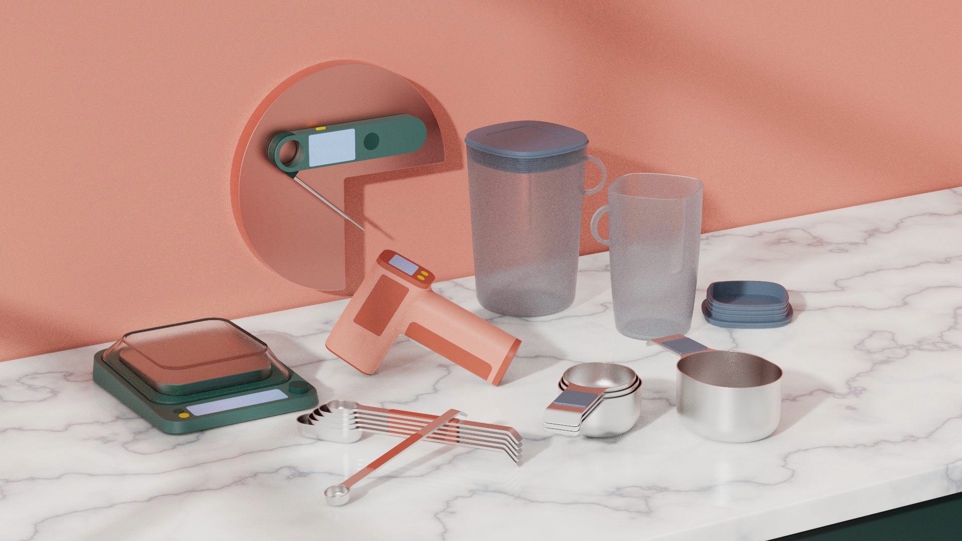
Product assortment aligned to the confidence journey—from prep to serve
Visual Brand Identity and Language
Kizen’s new VBL translated the brand house pillars into a cohesive, memorable identity.

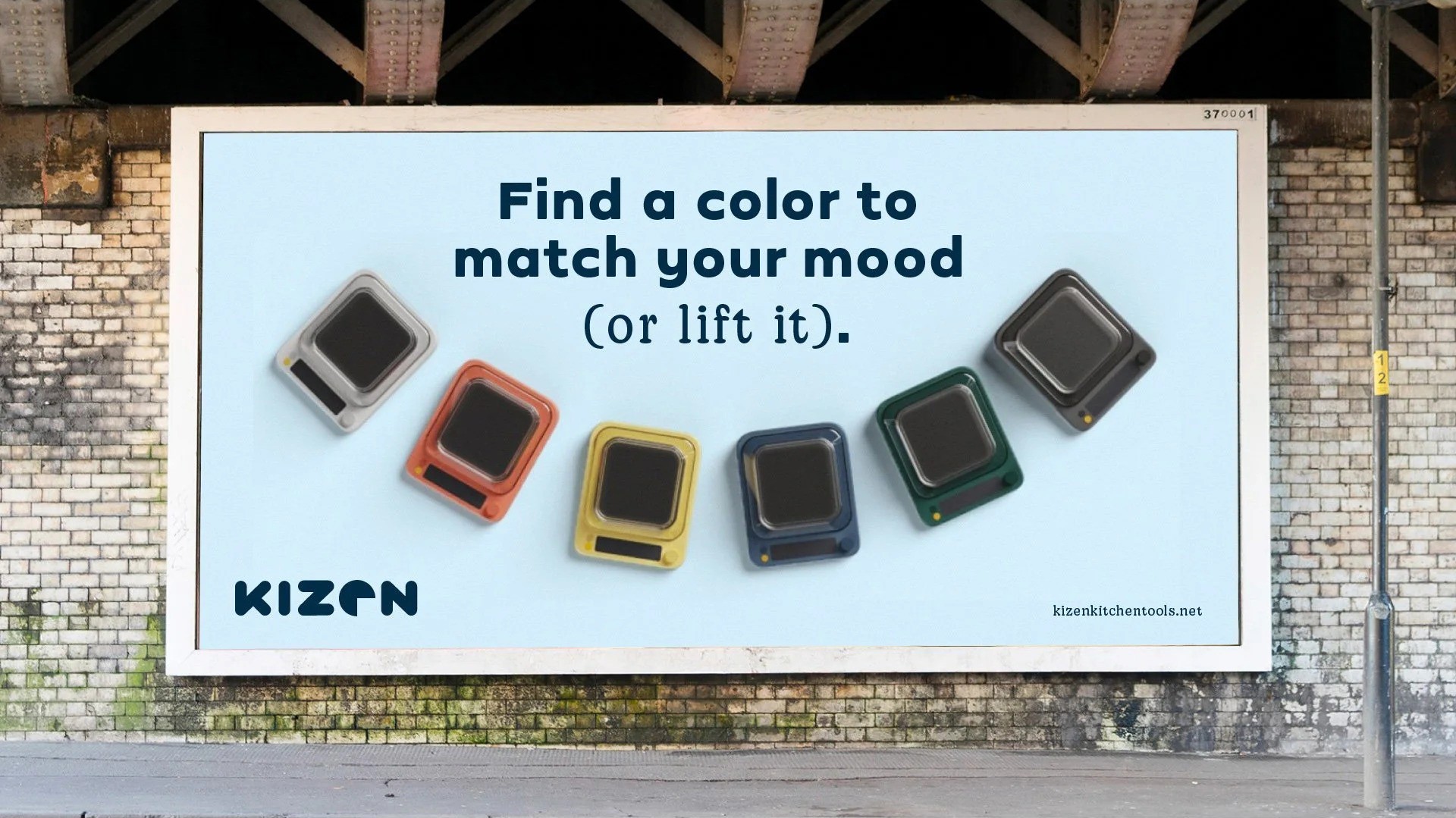
Color palette balanced warmth and technical clarity

Typography system conveyed trust and simplicity
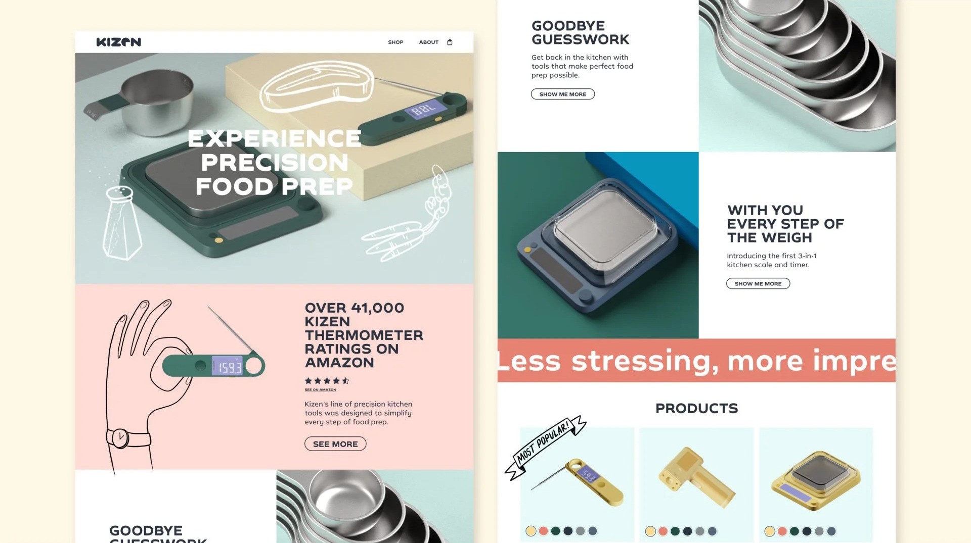
Iconography and layout reinforced ease-of-use and approachability

Hand-drawn illustrations humanized the system, expressing “Playfully Self-Aware” through packaging, UI, and inserts
Communication and Content
We built a communication system that extended the brand across every channel and touchpoint. Brand and product videos captured tone and use case. Website and collateral delivered utility with clarity. Social content and press created community and energy around the launch. Paid media and promotional strategy executed the visual voice and copy system.


In just two months, our process produced a high-fidelity brand experience prototype we could use to test our approach before making any investments in development or launch. This is how you de-risk entrepreneurship.
Good strategy feels like common sense in hindsight.
With the new strategy and visual identity in place, we didn’t rush to manufacturing. First, we needed proof.
To validate the clarity of the positioning, we tested the brand with real home cooks using Voxpopme, a video feedback platform. The goal was to understand: Do they see what we see? Do they feel what we want them to feel?
We tested product images, colors, website mockups, and messaging across a spectrum of U.S. home cooks. The participants varied in age, location, family makeup, and brand awareness. Most cooked regularly for others. Some had never heard of Kizen, while others had considered buying but hadn’t yet committed.
The results confirmed our hypothesis:
Emotional resonance: Users felt empowered and relieved. The brand made them feel like they could “cook more often without fear,” and called out how it helped them “take the guesswork out of their tasks.”
Relevance across skill levels: Both beginners and seasoned home cooks saw Kizen as applicable to their needs. They found it trustworthy, helpful, and confidence-building.
Design validation: The clean, modern style of the brand and site increased interest. Feedback around color preferences and layout helped us fine-tune visual details before production.
Product clarity: Thermometers were seen as the anchor of the brand. Their clear utility gave context to the rest of the lineup and strengthened the positioning overall.
Pricing and credibility: Several participants noted the importance of reviews and price clarity to help with conversion—feedback we implemented into the eCommerce planning.
“The brand feels like it’s for me. Like someone finally got what it’s like to cook for real people.”
— Tara, 27, FL
Smart refinements before production
With feedback in hand, we implemented a few key refinements:
Dialed in colors to match stated preferences and improved perceived cleanliness and warmth.
Clarified value proposition in UI and messaging to emphasize ease, confidence, and reliability.
Reprioritized SKUs to focus on best-sellers and anchor the brand in what people loved most—our thermometers.
Only then did we move into the final sampling phase and prep for manufacturing—with a validated system, a confident direction, and a brand ready to win.
Clarity first. Coherence next. Beauty last (but not least).
That’s how we rebusinessed Kizen. And while this one never hit the market, it sharpened our conviction that design isn’t decoration—it’s alignment in physical form.